BMW Bike and Experience Design
My studio partnered with Csarnowski, an Atlanta based exhibit design firm to create a sub-brand of BMW and design a bike and experience for the bike to live in.
We started out doing research as an entire studio, then moved into smaller six-person groups that focused on specific issues that we found during the research portion. We were also assigned BMW as the base brand to create our sub-brand off of. Big shout out to Morgan Abney, Morgan Platt, John Lyons, Allie Paschal, and Berri Berto for being an amazing team, even over Zoom call.
12 weeks
Georgia Tech
User Research
Ideation
Experience Design
Fusion360
Keyshot
Branding
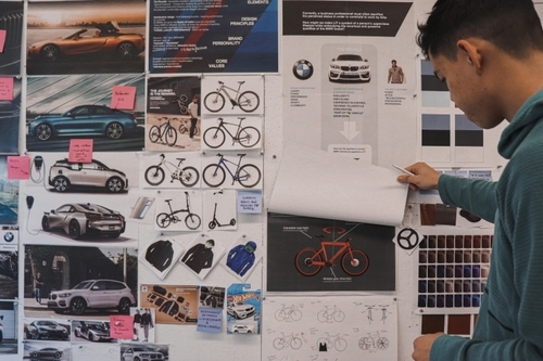
Research was split into groups and I chose to look further into the perceptions that people have of different types of alternative means of commuting by light individual transport. Numerous different Personas were then created to reflect what we found in our research.


Voice of Consumer
Consumer Traits:
Affluent, Professional and Respected in their field, Determined, Successful, and Active
Consumer Needs:
Needs to commute to a business professional workspace by bike.
Needs to feel safe on the road while cycling.
Needs to avoid over-exertion when commuting to work.
Needs the bike to appear luxurious and powerful to avoid stigmas from colleagues.


Refined Function:
Flexibility
Performance
Control
Security (Safety)
Speed
Status on the Road
Logistics
Refined Aesthetics:
Luxury
Professional
Speed
Fitness
High Class

The sub brand we created off of BMW was driven by what we saw in the voice of the consumer we created from a combination of our research and their customer. We then parsed our signature elements and visuals from the base values we saw in our personas.

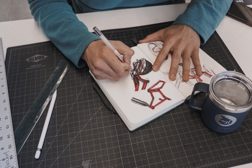
Ideas came to paper in sketches as we flushed out how form and function would interact on the bike. One of our primary goals after all was to maintain a sophisticated and slim yet athletic stance across the bike. Athleticism, Performance, and Luxury were at the forefront of all our ideation.


As ideas began to flush out, I began sketching closer details in order to articulate how exactly parts such as the gear and internal gear hub and belt would operate within the system and the effects this would have on the frame details.

As ideas began to flush out, I began sketching closer details in order to articulate how exactly parts such as the gear and internal gear hub and belt would operate within the system and the effects this would have on the frame details.

An important consideration was the chain–or in our case the rubber belt we decided to use. The chain has to be removable and because it can't break, it had to be independent from the actual stays of the bike.
As maintaining a gestural athletic stance was important to the goals and brand language of Pulse, intricate surface modeling was essential in smoothing out and creating organic curves even within CAD.


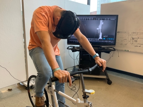
VRED visualization virtual reality software was also utilized in order to really help us really understand the scale and ergonomics of our frame.


Allow customers to really test the features on the Test Track.

Inviting outsiders in with the Juice Bar.

Facilitate the idea of dual personalities with the Lifestyle Display.

Create competition and stationary use with the Immersive Experience.

Let customers see the bike as they want it with the Customization Station.


